Showing posts with label Research. Show all posts

Thursday, 7 April 2016

Character 2: Mrs Laderman. Mood board.


In this mood board, I have chosen to use strong 80s themes, as well as Miami vice, gangster and femininity. This board focuses heavily on the aesthetics of my character. I want my character to look bold, strong and glamourous. For this board, I am going to talk through each of the images and discuss what I feel they reflect for my character:

(Left to right, top row)
1.A neon sign is very typical for 80's Miami. I like the colours used, they are bold but not too bright and harsh which is something I would like for my character. Due to my character being an ex-mobster wife, I feel that the name 'Tony's' seems like a very likely name for a place the gangsters of such era would own as a way to justify their income to the government as a cover-up to their actual money earning ways.
2. I like this graphic image for it's shapes and use of colours as it's very typically 80s. I would like to incorporate such shapes and colours for not only the hair and make-up but also the styling for my character. Geometric shapes such as these could be easily added with something simple such as hoops earrings.
3. I found this 80s make-up advertisement to be interesting as it's a very bold reflection on the beauty ideals of the era and also the shapes and blending styles of the make-up of that time. Although the make-up of my character won't be like this, it will have subtle influences due to her adapting to modern times.
4. I chose this image as I liked the use of bold colours mixed with pastel colours in a way that somehow works. I also felt it continued the mood of the board.

(Left to right, bottom row)

1. I liked this Miami Vice poster as it's a literal representation of the mood of my character: 80s, gangster and Miami.
2. I chose this image of Debbie Harry/'Blondie' as I see her as one of the key icons of the era. I really like the soft and well blended use of make-up that is used, as well as the chosen colour palette of pastel pinks.
3. I chose this interesting image as I really like the use of Marilyn Monroe, someone who is the epitome of glamour, which contrasts with the use of tattoos and a gun. This 'glamorous gangster' character that is created similar to the one in which I am aiming to create.
4. Lastly, similarly to the second image of the top row, I chose this one for the shapes and colours that are used, and want to focus on this pastel take on 80s fashion.  

Character 2: Mrs Laderman

Chosen Inspirational Word: Awakening

I chose the word 'Awakening' because I felt that it reflected what my character is going through. As she is suspicious about Claudia committing a murder, she has suddenly become fearful and aware of her surroundings as she no longer feels safe and feels she has a duty to prevent Claudia from committing another.

The key word has helped me to investigate strong female characters who are put in fearful situations where their aim is to protect themselves and others. I have looked at how they are represented as mother-like yet strong through their hair, make-up and clothing:


Character 2: Mrs Laderman

Red, Orange is the New Black. (n.d.). [image] Available at: http://tvnz.co.nz/orange-is-the-new-black/galina-red-reznikov-6061527 [Accessed 7 Apr. 2016].

Pulp Fiction. (n.d.). [image] Available at: http://ourgoldenage.com.au/film/pulp-fiction/ [Accessed 7 Apr. 2016].


For my Mrs Laderman character, I am going to have her as someone who is suspicious of her neighbour, Claudia. Mrs Laderman is aware that Claudia is not mentally well due to her agoraphobia, but has reason to be suspicious that her illnesses go beyond that. She has agreed to keep Claudia in the know about the outside world in order to keep her close to keep an eye on her.

As an individual, Mrs Laderman is an ex mobster wife, who's husband's death is not discussed. She lives in Miami, where she has lived most of her life. Due to her past, Mrs Laderman was big in the Miami scene back in the 80s, where her ex husbands profession provided her with a lavish lifestyle when she was young. Mrs Laderman is nostalgic of the past and her hair, make-up and clothing choices are influenced from this time, where she remembers herself as her happiest.

As a large part of the audience demographic is older women, typically around 40, they may find this character type relatable and even find the nostalgic influences in themselves. As Mrs Laderman is a mother-type figure to Claudia, the relationship between them will be very familiar.

The scene I will be putting this character in is one where she is snooping around Claudia's house while Claudia is upstairs asleep. Her aim is to settle her suspicious that Claudia may have committed a murder. While she is doing this, she accidentally knocks over a glass ornament and cuts her hand trying to pick it up.

Monday, 4 April 2016

Character 1: Claudia. Mood board.


In this mood board, I have red, white and pink throughout. Firstly, red because I am designing my character after she has brutally murdered her boyfriend. Therefore, she will be covered in blood on her face, as will her hands. Secondly, I have chosen white as a suggestion of purity. Before the murder, the character is sympathised with. Although she is sometimes controlling in behaviour, the audience is made to understand that she is anxious of the world and a lost soul. She is innocent as a whole, but we later find she had a very dark side to her that initially only. suggested. Only later do we see it's full potential. I have also chosen pink as this ties in with the white. Pink is typically a cute colour and one I plan to have her wearing when she commits her murder. The pink also reflects her preppy side which she has adapted through watching a lot of American tv and has created an idealised version of herself.

A lot of my chosen images are ones which I feel reflects the contrasting sides to Claudia's personality. I particularly found this in cute or well presented human forms with something disturbing such as weapons or blood with it. My favourite image amongst these is the top left where there is a woman in a pink and well-fitted dress with complimenting accessories holding a chainsaw. I feel like this is a literal representation of my Claudia character.

Character 1: Claudia

Chosen Inspirational Word: White Rose


I chose the word 'White Rose' as I felt it reflected the innocent appearance that I want for my character. My reason for wanting my character to look this way is 1) the audience will not understand her complex psychotic tendencies from appearance also 2) because she doesn't perceive herself as a bad person. From this key word, I was inspired to look at existing films and Tv series where there is a psychotic or manipulative female role who is innocent in appearance:


When designing and planning for my character, I will have her in a scene where she just committed her first murder. A female who she had decided was involved with her boyfriend Quentin (although the audience will know that this is definitely not true as he is imaginary). From this, she will have blood splatters on her. Aside from this, she will have her typical type of hair and make-up: feminine, preppy, but with a slight change that makes her slightly more sinister in appearance to her usual type, most likely through her eye make-up.

Character 1: Claudia

Scream Queens. (2015). [image] Available at: http://www.hercampus.com/sites/default/files/2015/10/25/poster-de-scream-queens_1.jpg [Accessed 4 Apr. 2016].

The way that I will incorporate this character is by having her as one of Dexter's serial killer victims
My only adaptation to the given character description is that my character is into Horror Tv series as well as Horror films as this leaves her current influence/obsession more open.
From this, I have decided to make the character's current Horror Tv Show fascination to be Scream Queens. The visual aesthetics of the main character's in this series is very girly, preppy and pristine which I will incorporate into the appearance of my character.
Although my series is set in Miami, my character will not be influenced by this as she is agoraphobic, therefore she doesn't go outside and would not need to adapt to the hot climate, especially as houses are generally air conditioned.
Because there is a younger part of the age demographic for the Dexter series, her appearance and interests will be based on current trends and popular media.

Sunday, 3 April 2016

Production Mood board


Above is a mood board that I created to reflect the mood and themes of my chosen series, 'Dexter'. My mood board focuses on the three main topics of the series: crime, death and blood. In the series, blood splatters are a reoccurring topic. I have therefore chosen images of different ways that blood and blood splatters are addressed, and the emotions that they provoke. In some cases, the use of blood is used in a sexual manner. Blood is often used spilled over intimate areas on a human body, most likely used to provoke conflicting feelings about an image. Blood is seen as such a gruesome and traumatic medium, yet it is used as a way to appreciate the human form in a male-gaze type manner - a typical audiences fears and fantasies combined. My top left photography image and my middle second from the left catwalk image gives inspiration to this idea and suggestion. I feel that this approach to feelings about blood is something that subtly but often occurs in the Dexter series. The rest of my chosen blood images are various ways that blood is addressed artistically but also it's like to police and crime.

In the series, I feel that the location is very important, and is deliberately used as part of a series of such dark topics. From the series being set in Miami, the audience almost fantasizes about Dexter's serial killer life, as he seems to have it all. Dexter lives in a idyllic home surrounded by sun, beaches and a general holiday type mood. Dexter works as part of an FBI team, which in America is a particularly well respected position. Despite all of this, every aspect of Dexter's life is dark and often disturbing. This is why I have chosen darkly lit pictures of the beach and palm trees to reflect how this is done.

Lastly, I have included a darkly lit photographic picture that suggests someone suffocating and also a graphic crime scene. I chose these images as they reflect how the killing in Dexter is typically done. As it's reoccurring through the majority of the episodes, I felt this was important as part of setting the mood.

Saturday, 2 April 2016

Brief 2: Claudia and Mrs. Laderman - My Chosen TV Series: Dexter

Dexter Promotion. (2013). [image] Available at: http://horrorpedia.com/2013/07/29/dexter-tv-series/ [Accessed 24 Mar. 2016].

 
Dexter Behind the Scenes. (2014). [image] Available at: https://uk.pinterest.com/pin/322640760775824468/ [Accessed 24 Mar. 2016].

Dexter Scene. (2012). [image] Available at: http://geektyrant.com/news/2011/6/29/crime-scene-photo-from-dexter-season-6.html [Accessed 24 Mar. 2016].


My chosen TV Series for this brief is 'Dexter'. I chose this series mostly because it is a series that I watched a long time ago and enjoyed very much. I also felt that it was very approachable to design for, and left me a lot of leeway when designing.
My series has a large audience demographic, with ages ranging from 18-49. Therefore, I will consider the variety of ages when creating my characters, and how the audience will be able to relate to them.
I feel that my series appeals to the large demographic simply because the story line is always very thrilling and unpredictable. So much so, that romantic interest for the audience isn't needed and is very minor to the general plot. The series also appeals to be people with an interest in blood and some gore.
My series is set in modern-day Miami, therefore my characters will need to visually reflect people we see in everyday life today. As the setting is in Miami, there will be a few cultural differences to what I am familiar with, as well as geographical, meaning my characters will be suited to the hot climate in which they live.

Saturday, 26 March 2016

Research - Inspiration - The Blonds Fall '13

The Blonds FW 13. (2013). [image] Available at: http://fakebrandy.blogspot.co.uk/2013/02/horror-films-from-designers-blonds.html [Accessed 7 Apr. 2016].

In this collection, the make-up features bold cat-eye make-up, nude lips and messy blonde hair. I feel that this look is inspired heavily by the blonde women who frequently featured in Alfred Hitchcock's horror films. The look is over dramatised for a high impact look and contrasts against the black and red colour scheme used throughout the collection.
Not only do I find the hair and make-up inspiring to a classic blond bombshell often used in such genre, but also the splattered blood used to shock and juxtapose with the hair and make-up.
Something which I feel is notable to the look is that all the skin tones that feature are pale, but yellow tones in the platinum hair tend to feature more when the skin is ever so slightly darker. I feel that this is to match the tone of the hair closely to the skin so that they blend together and make the clothes stand out more against them.

The collection follows Horror from a large spectrum, from Gothic Horror with classic concepts such as Vampires, Mummies and  Psychos and then direct inspiration from modern horror with films such as 'The Shining', 'Pscyho' and 'The Birds'. I hope to use this collection as inspiration from the two briefs as due to the horror influences being both old and new.

Research - Photography

Flickr, (2010). Return of the bloody girl. [image] Available at: https://www.flickr.com/photos/bassqee/4727844785/in/photolist-8cMrxg-dfvuCD-cjgmYm-4JEgp4-L5tfT-hG65Gb-ofsEno-a5xSjA-ngt1Pp-6gSwq-nvbghc-qmZ87f-9U4d6Z-edQmAZ-9A4ei2-9AJCtp-5yzBN7-rEerSi-4CzdyS-A5eTGr-pFFyux-8U7HX9-ofjsYw-e3SXE4-6HyguB-mfFa29-pMmCrC-8LBrEE-aha9DS-5JzycH-bcCEDi-ehtMZx-4CYzUL-5PdmKh-J86gt-98PTSN-hkJ6KM-aeW9Mq-4mXvoz-7BbCLe-97JzCo-8ZzQkj-4CU6zJ-5mYQ95-hx8Qk5-5RzUkk-2yxrY6-3m2N8b-bEF26t-n1mUrv [Accessed 8 Apr. 2016].

"Return of the bloody girl" by Colin Stebbing

I used Flickr as a way to find photography from people around the world to find an image that I feel reflects the story line I am reflecting in my Claudia and Mrs Laderman work.
As the storyline I am reflecting is one where a young and supposedly innocent girl has impulsively murdered her boyfriend, I felt this image really reflected that. I do not plan to have my Claudia character to be as excessively bloody as this, and I don't feel it is quite realistic enough for a Tv series. The mood I feel this image gives, with the youth combined with psychotic is a strong link to the intention of my work. I also like the use of blood on her hands as well as her face as I feel that it suggest that the murder was raw and impulsive, rather than thought and correctly executed.

Research - Horror in Music

Wolf Alice - You're a Germ


https://www.youtube.com/watch?v=ZpomZoueWa0


[screen shots]


I've chosen to look at the music video for 'You're a Germ' as it is a video that uses traditional Horror themes including Psychos, Zombies, Clowns, etc.
In video, it is set in a cabin-like house in the woods. The story line repeats itself over and over, but each time the characters try to escape the inevitable, and regardless of a new strategy each time to try to escape their fate, something new comes along and they fail. I feel that the message behind the video is that there is a path set out in life and regardless of the choices you make, what's supposed to happen will happen. 
The inspiration I draw from this video is the new take on each traditional horror character type, and their interpretation of their appearances while still making the characters recognisable and also maintain their 'Horror' aspects.
I feel like the main female character is styled deliberately to make the audience sympathise and connect with her and this is something I would like to bring to my Claudia character as a way to give the audience the wrong impression about her character in the series as they later find out she is in fact the antagonist.

Wednesday, 3 February 2016

Research - Victorian Beauty Ideals

Victorian Hair


Below are a series of collages I made with images of Plates from the 'Fashions in Hair' book by Richard Corson. I have chosen the plates I feel sum up the era well and help to support my information/research I have gathered.


Early Victorian Men (1830-1860)


1830 - 1840 - In this part of the period, hair length was generally short to medium in length and fairly ruffled and messy with waves that were often swept to the side. Side burns / mutton chops were sometimes seen but facial hair in general was minimal.

1840 - 1850 - Hair has increased in length since the 30s and has become more medium to long in length. Hair is generally straight but occasionally some subtle waves. No facial hair was still seen but sometimes alone beards, mustaches or a combination of both was starting to come into fashion.

1850 - 1860 - Hair has become shorter again, usually sitting just below the ears. The hair is usually textured with waves. Facial hair has almost completely gone but side burns or mutton chops are sometimes present.

Late Victorian Men (1860-1900)


1860 - 1870 - Hair is now usually just above the ears and either straight or flicked at the ends. The parting is usually at the side or swept back. Full facial hair is in fashion but also sometimes a beard with a mustache is seen.

1870 - 1880 - Hair is still often short and facial hair has lessened again to no facial hair or a mustache on it's own. Only sometimes a beard is present.

1880 - 1890 - Hair is now even shorter and neat and often straight. Sometimes the hair is long but quite rare. Mustaches, often paired with beards is now in fashion.

Early Victorian Women (1830-1860)


1830 - 1840 - In this early part of the period, the hair is parted down the middle and often has a type of bun using the back section of the hair on the head. The remaining hair from the front section is plaited or made into ringlets from the ears down, leaving the top straight. The length of the hair usually ended around the jawline.

1840 - 1850 - The hair in this part of the period is very similar, only the hair is now longer and often finishes just past the collarbones. Occasionally, remaining hair that is down is plaited and brought back under the ears and the ends incorporated into the bun. 

1850 - 1860 - In this part of the period, the front section of the hair is parted down the middle and pulled back over the ears and is often waved. The back section is usually in a spiral twisted bun or rolled back with height.

1860s - Again, the hair is parted down the middle, only this time the front and back halves of the hair flow together rather than separated. The back rolling with height element of the 50s is now heavily used with much more visual complexity; coming in from various angles with various shapes and sizes.

Late Victorian Women (1870-1900)


1870 - 1880 - The hair has evolved even further from the 50s - 60s to now into the 70s. Hair rolls, also known as barrel curls, are used in abundance. The hair is covered in rolls starting from the front of the head coming all the way down to the very back. Occasionally, the hair may be finished off with ringlets falling from the very back.

1880 - 1890 - The fashion of the rolls are still going, only now they are starting to fizzle out subtly, with the rolls being kept to just the back section and front being brought back but waved. Tiny fringes at front of the hair that resemble baby hairs which were often curled are now seen.

1890 - 1900 - The hair is now all brought back in one continuous roll with added height around the head, all meeting in a small bun on the crown or just below. The bun sometimes features small adornments for evening wear.

1900s - The height of the hair leading to the bun has increased dramatically, as has the bun, which is now at the top of the head and styled in various creative ways.

For my final design, I plan to do a type of bun that is seen on the 1890-1900s plates, as the book I have chosen is set in 1897. This is very late Victorian, which is obvious due to it's similarities to the popular bouffant type bun seen in the Edwardian era which came not long after. Therefore, this hairstyle seems like a natural choice for my female character.

Victorian Make-up


Queen Victoria Picture: Queen Victoria. (n.d.). [image] Available at: http://www.scottish-country-dancing-dictionary.com/dance-crib/queen-victoria.html [Accessed 8 Feb. 2016].
King Edward Picture: King Edward. (n.d.). [image] Available at: http://cookit.e2bn.org/historycookbook/22-112-edwardians-and-ww1-Food-facts.html [Accessed 8 Feb. 2016].

In the Victorian era, make-up was something to be ashamed of. As Queen Victoria was in reign, she herself did not wear make-up, nor did she approve of it. During this era, royalty was extremely influential in terms of fashions and opinions, therefore this influenced what the people of the country of that era did. It is said that her son, who later became King Edward after Victoria's death, was highly promiscuous. Victoria blamed this on the influence of actresses and prostitutes, the only women of that time to wear make-up. Therefore, in Victoria's eyes, make-up equaled women of poor reputation. After Victoria's death, with King Edwards leniency, make-up was slowly started to be reintroduced into society.

A pale complexion was the height of fashion during the Victorian era and also suggested that you were not a working woman, and therefore were not in the outdoors long enough to get a tan. Women were supposed to be sweet, respectable and fragile in nature, and a pale skin was supposed to support this ideal. Unlike previous eras, a pale/white complexion was achieved with a non-toxic substance. This substance was Zinc Oxide, which was a white mineral powder. They sometimes even drank vinegar as they felt it helped to prevent a tan. 

Due to the secrecy surrounding cosmetics, they would be bought in secret and hidden in their rooms. Rouge was added to their cheeks with what was simply beet juice, which would be applied lightly to give a natural appearance. Eyeshadows were made with lead and antimony sulfide and lipsticks were made with mercuric sulfide - again, these were only applied to enhance features and were not applied in a way that would show they were wearing make-up.


Victorian Woman Picture: Victorian Woman. (2014). [image] Available at: https://uk.pinterest.com/explore/victorian-paintings/ [Accessed 8 Feb. 2016].


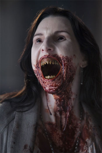
As my character is a Victorian Vampire, a lot of these traditional Victorian attributes cross-over with that of a Vampire. Therefore, I shall be ensuring that a very pale complexion and redness of the lips are key features in my design, as well as some subtle eye definition. Thankfully, these features do not interfere with a Vampire concept, therefore I will be able to incorporate them in a way which is historically accurate without reducing the impact of my design.

References for this post:

beautifulwithbrains.com, (2010). Beauty In The Victorian Age. [online] Available at: http://beautifulwithbrains.com/2010/08/06/beauty-in-the-victorian-age/ [Accessed 8 Feb. 2016].

Corson, R. (1965). Fashions in hair. New York: Hastings House.

Corson, R. (1972). Fashions in makeup. New York: Universe Books.

Research - Importance of Continuity

Blogger, (2016). Harry Potter. [image] Available at: http://nicklongfilmmaking.blogspot.co.uk/2015/02/the-filmmakers-guide-to-continuity.html [Accessed 14 Mar. 2016].


When creating a make-up design for a film or TV series, it is important to consider continuity. When the consideration of continuity is absent, it not only separates the audience from the escapism appeal of the film and bringing them to the reality of it's production, it also reflects badly on the quality of the film and therefore it's producers.
Continuity has to be maintained by the costume, make-up and set departments. Failure to do this is a poor reflection on the person(s) fulfilling their role and may even impact their future employment, therefore it is is even in their personal interest.
As a make-up artist, continuity can be maintained by taking their own personal continuity photos, making templates, writing notes and being on set and looking out for any changes to the hair and make-up during shooting that would impact it.
During the recreation of a make-up, a make-up artist can refer to these things to help them with continuity. Templates can be used to recreate exact placements and sizing of small prosthetics and other materials which can be inconsistent. Notes can allow them to refer to next steps that are taken during the application. Photos mean that you can pay close attention to detail to ensure that any outcomes that may not be clearly outlined in the design or notes that can be added again in the same way. 

Research - The Evolution of Fangs


A reoccurring feature among visual and descriptive representations of the Vampire is the fangs. Throughout history, fangs have been a key feature due to them being the tool to carry out the Vampire way of living - drawing blood. In modern day, regardless of the placement of the fangs among the mouth, the appearance of fangs on a human-like form is an instant recognition for the identification of a Vampire. I am going to research into the various placements and use of fangs on a Vampire character through looking at film and television and the approach to this key feature.

Film - Interview with the Vampire: The Vampire Chronicles (1994)
Directed by Neil Jordan

Interview with the Vampire. (2013). [image] Available at: http://thedancingrest.com/2013/07/08/different-vampire-teeth-for-different-movies/ [Accessed 7 Mar. 2016].

IwtV: Normal fangs. (2013). [image] Available at: http://thedancingrest.com/2013/07/08/different-vampire-teeth-for-different-movies/ [Accessed 7 Mar. 2016].

IwtV: Attack fangs. (2013). [image] Available at: http://thedancingrest.com/2013/07/08/different-vampire-teeth-for-different-movies/ [Accessed 7 Mar. 2016].


In this film, a very traditional looking set of fangs is used when the Vampire is going about it's regular life. The fangs are not too distinctive but are also clearly different from a normal person's set of teeth. When the Vampire is in attack mode, about to or currently feeding, the fangs grow slightly longer, sharper and more obvious in appearance. Although the fangs may appear traditional, a slight double-fang effect is done with a total of 4 fangs, 2 either side which are next to eachother, the inner ones being shorter and less sharp. Although I like this fang concept, I do not find it to be inspiring or interesting enough for me to want to have it in my design although I appreciate that it is both simple and unique.


Film - Fright Night (1985)
Directed by Tom Holland

Amy Peterson. (n.d.). [image] Available at: http://frightnight.wikia.com/wiki/Amy_Peterson [Accessed 7 Mar. 2016].

Andrew, R. (2015). Fright Night. [image] Available at: http://crypticrock.com/fright-night-a-decade-defining-horror-film-30-years-later/ [Accessed 7 Mar. 2016].


In this film, the fangs used are completely traditional in placement, with them being only on the canine teeth in a traditional human mouth set up. In this representation, like the previous film mentioned, there is also a difference between normal and attack Vampire mode. As shown in the image above, the mouth becomes unnaturally wide, and the teeth placement and quality becomes distorted. This Vampire representation is particularly disturbing to me (therefore effective) and likely to require a high set of make-up design skills which would be too advance for me to incorporate into my design at this stage.


Film - Nosferatu: A Symphony of Horror (1922)
Directed by F.W. Murnau

Nosferatu fangs. (2013). [image] Available at: http://thedancingrest.com/2013/07/08/different-vampire-teeth-for-different-movies/ [Accessed 7 Mar. 2016].

Nosferatu fangs representation. (2013). [image] Available at: http://thedancingrest.com/2013/07/08/different-vampire-teeth-for-different-movies/ [Accessed 7 Mar. 2016].


In this film, the fang placement is different from the norm. I find this particularly interesting due to the film being so old and yet there is such a big stray from the traditional aesthetics of the vampire. Typically, unique takes on the Vampire are seen in the late 20th Century but comes back around to traditions in modern day. To me, the way in which a fang puncture on the neck is described, it makes an awful lot of sense to have fangs set out this way as they are close together, as described in early Gothic Horror, yet the actual descriptions of fangs are on the canine teeth, which are too far away to create what is described. For this reason I chose this style of fangs for my design after reading early fang puncture descriptions as this is not only unique to typical takes but I also feel it makes a lot of logical sense too.


Film - From Dusk till Dawn (1996)
Directed by Robert Rodriguez

Pinterest, (2015). Snake Vampire. [image] Available at: https://uk.pinterest.com/pin/500110733597833327/ [Accessed 7 Mar. 2016].

This Vampire adaptation is very interesting as it's a 'Snake-Vampire' hybrid which means that the design for the fangs was very particularly and also very unique. From what I can see, the design has made the placement of the fangs traditional, placed where you would expect human canine teeth to be. But, with this twist, there is no teeth in between, only gums, just like a snake. The fangs are also very long, thin and pointed like a snake. This adaptation makes a lot of sense as the teeth between fangs, as proved by real life snakes, are redundant in design. Obviously, these types of fangs would not have been appropriate as a design concept for my current level of skills, and also isn't necessary as mine is not a snake cross over, but regardless it works well.


Film - 30 Days of Night (2007)
Directed by David Slade

30 Days of Night fangs. (2013). [image] Available at: http://thedancingrest.com/2013/07/08/different-vampire-teeth-for-different-movies/ [Accessed 7 Mar. 2016].

In this film, as seen, this interpretation includes all of the teeth in the entire mouth to act as fangs. All of the teeth are sharp, but not particularly long. This is because the vampires in this film have a more of a 'eating' type of approach to attaining human blood, rather than simply drawing it with two simple fangs. This definitely adds more horror type aspect to the Vampire, as the conclusion of this type of feeding is most likely certain fairly quick death instead of other traditional outcomes post-feeding. I feel that this fang design is very particularly to the modernism of the film, as well as the individual characteristics of a Vampire here. Although I like this take on the design, it is not someting I can apply to my own due to it not relating close enough to my chosen character.


Tv Series - True Blood (2008 - 2014)
Directed by Alan Ball

McGarry, L. (2013). True Blood Fangs. [image] Available at: http://primetime.unrealitytv.co.uk/missing-true-blood-best-funniest-sexiest-alexander-skarsgard-pictures-from-around-the-internet-finale-spoilers/ [Accessed 7 Mar. 2016].


True Blood fangs representation. (2013). [image] Available at: http://thedancingrest.com/2013/07/08/different-vampire-teeth-for-different-movies/ [Accessed 7 Mar. 2016].


In the Tv series true blood, the fangs are typically hidden until it is feeding time. In which case, the fangs retract. Although these fangs are fairly traditional (like most modern day adaptations as stated before), this has a slight difference with the fangs being the next teeth in, the lateral incisors. To me, due to my previous point of the original descriptions of fang punctures being quite close together, this placement makes quite a lot of sense. Not only this, but when the audience sees a Vampire, in his obvious Vampire form, the actors mouth needs to only be slightly open for the fangs to be visible, which is more natural and obvious to show them off. For me, this one a close second consideration for my design approach as the consideration behind the design is one that is traditional, aesthetically pleasing and logical.

Research: What is 'Horror'?

"Horror

1. an intense feeling of fear, shock, or disgust.
"children screamed in horror"
synonyms: terror, fear, fear and trembling, fearfulness, fright, alarm, panic, dread, trepidation
"children screamed in horror"
antonyms: delight

2. a thing causing a feeling of horror.
plural noun: horrors
"photographs showed the horror of the tragedy"
synonyms: awfulness, frightfulness, cruelty, savagery, gruesomeness, ghastliness, hideousness;

3.a literary or film genre concerned with arousing feelings of horror.
"a horror film"

4.intense dismay.
"to her horror she found that a thief had stolen the machine"
synonyms: dismay, consternation, perturbation, alarm, distress; More
antonyms: satisfaction
humorous

5.used to express dismay.
exclamation: horrors; plural noun: horrors
"horrors, two buttons were missing!"

6.intense dislike.
"many have a horror of consulting a dictionary"
synonyms: hate, detest, loathe, greatly dislike, have a strong aversion to, abhor, abominate, be unable to bear/stand
"Laura had a horror of pubs"
antonyms: love

7. an attack of extreme nervousness or anxiety.
plural noun: horrors; plural noun: the horrors
"the mere thought of it gives me the horrors""

All text above is taken from the Google search definitions of 'Horror': 

Harvard Reference of text: Google, (n.d.). 'Horror Definition' Search Results. [online] Available at: https://www.google.co.uk/webhp?sourceid=chrome-instant&ion=1&espv=2&ie=UTF-8#q=horror%20definition [Accessed 15 Feb. 2016].

The Horror Genre

Although I am looking at Horror from a genre perspective, I feel it is important to understand what the word 'Horror' means in other context as the definitions for the word coincide with the aspects of the genre. The 'Horror' genre is created to give the audience negative emotions. It is supposed to play on the audience's fears, nightmares, anxieties and even own negative experiences. The Horror genre is to, put simply, horrify us.

The Horror genre derived from the Gothic Horror genre. The classic novels were the initial direct inspiration for the Horror Genre in films, books and other media but has evolved over time, as has the audience. When the Horror genre came about, the idea was to shock the audience/reader by playing on old fears and creating new ones. Although that idea is still the same today, the Horror genre to a modern spectator is a much broader, and simply more direct and shocking than what was considered Horror when it first came about from the Victorian era.

Victorian Horror. (2014). [image] Available at: http://www.anglotopia.net/british-history/guest-long-read-victorian-spooks-charles-dickens-art-good-ghost-story/ [Accessed 15 Feb. 2016].


A key theme, which is not always seen to be obvious, but is reoccurring, is the theme of sex or lust. This theme was used, although not directly suggested, in most of the classic Gothic Horror books, particularly ones of a vampire focus. This theme is often taken from 2 completely different angles: the fear of rape, or the seduction of the unknown and forbidden. Books such as Dracula took the theme from both of these angles, from the force from Dracula on to Lucy, or the seduction of Mina. In modern film, these themes are a lot more literal and obvious. The appeal of sex used in horror is not simply because 'sex sells' but instead because it is in fact one of the most vulnerable moments in persons life - literally, due to being stripped to a naked self, or, emotionally, where a person is putting trust into a person by allowing intimacy. 

Dracula film. (n.d.). [image] Available at: http://cinemathequefroncaise.com/Chapter5-1/Read_05_01_DRACULA.html [Accessed 15 Feb. 2016].

In old Horror, the focus was typically on monsters: Vampires, werewolves, ghosts, witches, demons, etc. In modern Horror, the focus is typically on things we feel are more applicable to real life, such as psychopaths or serial killers. This is most likely due to influences such as, in the Victorian era, people did not usually travel, and their access to media, mostly news papers, were usually local. This would have made people feel like there was a whole world of the unknown, and monsters seemed like a concept that was not completely ludicrous, but in fact quite possible. In modern society, we are aware of a large amount of what goes on in the world we live, as well as seeing a large quantity of it. Modern media allows us to know most of the horrific stories that go on, therefore, our fears are more on those that could be around us; murder, terrorism, torture, war and even the fear of an apocalypse. This means that modern day horror simply touches on monsters more out of tradition, and tend to not scare people in the same way that modern fears do.


Research - Film: Excision vs. Twilight - The Modern Vampire?

Following my post about what our fears were in the Victorian era (fantasy monsters) vs. our fears in modern day (real life fears influenced by media) in my 'What is Horror?' post: I pose the question as to whether the Vampire concept is phasing out / used for tradition purposes, or if it is simply evolving? In my opinion, the answer is both.
I have chosen the films 'Excision' and 'Twilight' to look at the modern Vampire. I want to consider the evolution of the Vampire concept to now, how it is interpreted, and how I can use this information to create my own design.


Traditional Modern Vampire - 'Twilight':


In Twilight, Vampires are of a super-human nature and are extremely mysterious and compelling. Their Vampire features are what makes them attractive to the human - Light hazel eyes, glowing white skin, and brooding facial features. The Vampires have super-human physicality too, with super strength, speed and even mind-reading. These attributes are quite traditional to the old ideas of a Vampire, but adapted slightly so that the Vampires could fit into modern society.

Twilight - Edward Cullent. (n.d.). [image] Available at: http://www.fanpop.com/clubs/edward-cullen/images/30128794/title/imagens-edward-twilight-photo [Accessed 16 Feb. 2016].


Cullens at highschool. (2010). [image] Available at: http://cdn2-b.examiner.com/sites/default/files/styles/image_content_width/hash/58/32/Lunch%20Scene2_1.jpg?itok=vhAvHIMS [Accessed 16 Feb. 2016].


Despite Vampires mostly belonging to the 'Horror' genre typically, Twilight has not gone for this angle, despite blood, death and lust still coming into the story line. This is likely due to a modern audience being immune to the horrors of a Vampire, but instead it has been made into a  film mostly targeted to preteen girls, a very different audience to that original Vampire concept intention. This is most likely due to the Vampire concept being worn out of impact, and instead has been left for a whole new take on it.

Due to my perception of the Twilight film, I do not feel that the Twilight Vampire is something that I wish for my final design to be inspired by. I do not feel that the adaptation of it's features to fit into modern society has a big enough impact for the character I am designing for, therefore I aim to distance myself from such approach.


Modern Horror Vampire - Excision


Excision is a film about a teenage girl who's dream is to become a surgeon. She suffers with mental health condition Borderline Personality Disorder and has a fetish for blood. The film features various scenes of her vivid dreams both relating to her wish to become a surgeon and her sexual interest in blood which feature of an extreme and horror nature. Although this film is not explicitly about a Vampire, the character's physical features are closely linked to that of a traditional vampire - Deathly pale complexion, lack of color to even the lips, very thin and of course has a strong link with blood as a means for boosting her as an individual.

Excision Film. (2012). [image] Available at: http://batcavereturns.blogspot.co.uk/2012/10/excision.html [Accessed 16 Feb. 2016].

Excision - Dream Scene. (2012). [image] Available at: http://www.ohmygore.com/critique-excision-1049.html [Accessed 16 Feb. 2016].

The basis of this character could have easily just have been an actual vampire, but this would not have as high impact as a Horror film as the character adaptation that has been undergone. As I stated before, modern fears are often around the fear of Psychos - people who are mentally unhinged and therefore a threat to those around them. The film covers traditional vampire values: death, blood and lust, only this time it is done to shock. In the ending of the film, the character drugs her sister and a neighbour who she has captured (and hates) to do a lung transfer which she has innovated herself, killing her neighbour and also her sister who she aimed to cure from Cystic Fibrosis.
This film is set in a typical highschool movie way, which brings it closer to home for those who are watching it as the film isn't a fantasy - it is a reality.

Excision Highschool Scene. (2012). [image] Available at: http://www.theguardian.com/film/2012/nov/01/excision-review [Accessed 16 Feb. 2016].


As the aim of the brief is to adapt my character's description for the screen, my audience will be a modern one. Therefore, this film may be a great source of inspiration on how to use vampire-esque characteristics but still make a big impact to a modern audience. Excessive use of blood and gore with a hint of reality may make for a great modern horror design.

Tuesday, 2 February 2016

Research - The 'Gothic' Genre

The term 'Gothic' relates to a few concepts: The sinister, the supernatural, horror and Medieval Architecture.
Gothic typically refers to ideas around the Victorian era, although this is not exclusive.
The definition behind Gothic relates to the re-occurring ideas seen in Gothic Horror. Most Gothic Horror novels are set in castles or Monistrys with the descriptions involving architecture of a Medieval nature, which we are now still accustomed to finding unnerving in modern day society. Typically, key protagonists of the Gothic Genre are of a supernatural nature and ideas that are iconic even in books or films today (e.g Vampires and the hit 'Twilight' book and film series).

The Gothic genre is not purely visual, it forces the reader or viewer to become immersed in the psychological issues that is depicts. Re-occurring psychological themes include the fear of being trapped - whether that is physically or within one's self. The idea of being buried alive, a common fear, is often addressed in the Gothic Horror genre.
The fear of being out of control of your actions and/or having your self altered by drugs or a supernatural being. Dr Jekyll and Mr Hyde is a good example of this fear being played, where you have an inner evil inside yourself. Dracula presents the idea of being controlled by another being.

A clashing of past and present is often used in the Gothic genre - whether that be the outdated architecture or curses and creatures from the past that effect the present.

Research - Influences in High Definition Make-up Design

Pinterest, (2015). High Definition. [image] Available at: https://uk.pinterest.com/pin/534943261964427709/ [Accessed 8 Mar. 2016].

Here I am going to look at the considerations for a make-up that is done for a High Definition camera. The reason I am look at this is 1) because my assessment's final images will be taken with a HD camera and 2) I am designing for film/TV, which the majority of modern filming is shot in HD. It is important to consider how make-up looks under a HD camera as it is how the audience will view it. In most cases, obvious make-up, particularly the base, is undesirable as it is unappealing to the eye and can also effect the realism of a character.

Colour

With HD cameras, the colour red is easily picked up and therefore means that any redness on or under make-up can appear quite visible. A good way to tackle this is by using a green concealor under foundation or any other base. This is because green is opposite red on the colourwheel which means it completely eliminates it. This technique is particularly useful for those who suffer from acne or rosacea. When creating a character with everyday make-up, if you opt for a lipstick with a red tone, it is best to not go for something that is not too bright or bold as this is something the camera will pick up and make the audiences eyes focus on this unless this is relevant to the character.

Base

Due to small details being obvious, the texture of the base can be seen on the screen. This means foundations of a thick consistency, too much powder or general caked on make-up can be easily seen. A liquid foundation and liquid concealor is a good choice for a natural coverage. For a flawless coverage that looks natural on the skin, air brushing is a good technique as it is very light and not thick or textured. To set the make-up, a translucent powder that is applied sparingly, concentrating on the T-Zone (as this is the most common area for oil production) can be used or a setting spray.

Eyebrows

To add definition to eyebrows, a powder is more suitable than a eyebrow pencil as this gives a softer and more natural finish to the eyebrow as the risk with pencil is making them look to harsh and drawn on.

Double Checking

Before allowing a make-up to go in front of the camera, you need to look at the make-up very closely to ensure there are not even the smallest of imperfections to the make-up. This is because even the tiniest imperfection can be seen. A good way to check can also be to take a picture with a professional camera and zoom in to see anything that you hadn't noticed with the naked eye.

Wednesday, 27 January 2016

Research - Dracula (1992) film


Dracula Film Poster. (2016). [image] Available at: http://filmgrimoire.com/2014/03/20/bram-stokers-dracula-1992-i-am-the-monster-that-breathing-men-would-kill/ [Accessed 27 Jan. 2016].

This film was my first choice for watching a screen adaptation of the Dracula book as it's said to be the closest of all adaptations. I have already decided on my character I wish to design for, Lucy Westenra. I watched how the character was interpreted and concluded my feelings about the way in which she was depicted.
My feelings were nothing short of a disappointment. In the book, Mina and Lucy are such strong female characters, with a large focus and relevancy to the story line. I felt that was was not at all translated in the film, and they were reduced to nothing but sex objects. My chosen character, Lucy, was particularly poorly represented. In the book, Lucy is sensitive but very much in control of her actions, thoughts and feelings. In the film, Lucy was shown to be sloppy, dumb and easily influenced. I felt that there were a lot of completely unnecessary additions to the story line in the film such as the overuse of sex, drug addiction and a random lesbian-suggestion between Lucy and Mina that did nothing to the story line other than focus on the pleasures of the male audience. This was most likely done to keep the interest as the film often moved slowly and included irrelevant parts that seemed to be just filling out time. My one positive though, is that the film itself was visually stunning. Particularly the scene with my chosen character in her full vampire form being discovered for the first time.

Lucy Vampire Scene. (2013). [image] Available at: http://alysondunlop.com/tag/lucy/ [Accessed 27 Jan. 2016].

In terms of make-up design for my character, I felt that Lucy's everyday make-up was far too exaggerated for period that it is set as this amount would only be seen on prostitutes and actresses. Lucy is supposed to be a woman of status, who is admired by men of status, such facts wouldn't apply to the level of make-up. I felt that this was done to make the character appear a harlot, which she is in the film, but is inaccurate. Aside from this, I feel that the make-up for her vampire form was very impressive, as her white base was flawless and the dentures used for the teeth were highly realistic.

Lucy Westenra. (2014). [image] Available at: https://twitter.com/bramstokersd [Accessed 27 Jan. 2016].

Lucy Westenra - Vampire. (2015). [image] Available at: https://uk.pinterest.com/pin/274015958553348216/ [Accessed 27 Jan. 2016].

Tuesday, 26 January 2016

10 Key Descriptions of My Chosen Character in the Book

Here I have gathered various quotes in the original 'Dracula' book where Lucy's appearance is described. I will take each quote and gather the key words and phrases that will influence my design process.

1. "Lucy was looking sweetly pretty in her white lawn frock; she has got a beautiful colour since she has been here. I noticed that the old men did not lose any time in coming up and sitting near her when we sat down..."

From this quote I have picked up 'Sweetly pretty' and 'Beautiful colour' which means that my character, in her natural form, is very attractive. My plan is to design when she is a vampire, but this will be an important aspect as she is likely to have a very feminine hairstyle left from her true form, as well as feminine clothing, accessories and maybe even a hint of make-up.

  2. "Lucy is so sweet and sensitive that she feels influences more acutely than other people do..."

I found this quote to be relevant as I feel that her 'sweet' and 'sensitive' aspects means that she is probably very self aware, therefore she may chose to present herself in a way that is pleasing to others such as following current make-up and hair fashions to conform to people's preferences.

3. "All the time the roses in her cheeks are fading, and she gets weaker and more languid day by day;..."

This quote is relevant to me as this is part of the transitioning stage between her human self and her vampire self. The fact that the 'roses in her cheeks are fading' means that she has a lack of colour to her face, most likely pale, which is something important to incorporate in my design of her as a vampire.

  4. "I looked at her throat just now as she lay asleep, and the tiny wounds seem not to have healed. They are still open, and, if anything, larger than before, and the edges of them are faintly white. They are like little white dots with red centres..."

This quote is interesting to note as it describes a small injury on her neck, which is later relevant as we know it is a big part of the contribution to her becoming ill/vampire. Therefore, it might be worth adding to my design as it plays a big part in the story.

5. "Though she is still sadly pale and wan-looking. If she were in any way anæmic I could understand it..."

The fact that the character has specified that her complexion is similar to someone who is anemic, I feel it might be interesting to research into anemia and the typical physical signs that suggest that someone is.

  6. "My face is ghastly pale, and my throat pains me..."

From this, I note that paleness is a key element in the appearance of this character, therefore I feel it is not optional but instead vital to my design as it's mentioned various times.

7. "She was ghastly, chalkily pale; the red seemed to have gone even from her lips and gums, and the bones of her face stood out prominently..."

Again this reiterates the key element of her paleness. But this quote also tells about how there is no colour on darker fleshy parts of her face such as the gums and lips (and therefore most likely even the inner eyelids too such as the waterline) and also that she is very thin and defined in the face. This would suggest a lot of contour is necessary for this design to manipulate the structure. Due to her paleness, a contour with a greyish key tone instead of a typical brown-orange tone would be more appropriate as I would not want to add colour to the face.

8. "As the transfusion went on something like life seemed to come back to poor Lucy’s cheeks..." 

The quote tells us that when Lucy has access to blood, redness and life comes back to her face. As I am doing her in vampire form, depending on whether it's pre or post sucking blood, depends on whether I will add any colour.

9.  "Her teeth, in the dim, uncertain light, seemed longer and sharper than they had been in the morning. In particular, by some trick of the light, the canine teeth looked longer and sharper than the rest."

This quote is later in the book, near her death that is the final transformation into full vampire. These teeth are very important aspect of her vampire self, and I think it would definitely finish off my design if I am able to add sharp teeth to the final look.

10. "Van Helsing raised his lantern and drew the slide; by the concentrated light that fell on Lucy’s face we could see that the lips were crimson with fresh blood, and that the stream had trickled over her chin and stained the purity of her lawn death-robe..."

In this quote, it is said that when Lucy is seen in her vampire form, she has drawn blood and that her lips were 'crimson' with 'fresh blood' which would suggest that a fresh blood-like shade of red should be used on her lips. This has also gone down on to her clothing and therefore the is also blood on her chin.