Overall, I felt that I had particularly enjoyed this brief. I feel that a large part of this is due to there not being a timed assessment. For me, a timed assessment is one of the hardest aspects of a brief. Although being under time restraints is something I would have to be used to in the industry, I felt this allowed me to focus more on what I wanted to do creatively instead of what I felt would be achievable in the given time.
One of the most helpful aspects of this project was my presentation, as it allowed me to get feedback from my teacher, which made me realise I had spent too much time creating the appearance of my character, that I had overlooked incorporating a special effect into the design.
The hardest material I worked with was sfx transparent blood. I struggled to come up with a way that I could use it to create a splatter effect on my character, without ruining the clothing or getting it on things around my model or the floor. In the future I will need to look into more ways to be able to control the product.
My most successful material that I used in the project was Cinewax. The first few times that I had practiced with this product, I felt the blending almost impossible to achieve. When I used it for this project to create my cut, I felt that I had perfected my technique and was very happy with the outcome.
(255 words)
Showing posts with label Outcome. Show all posts
Showing posts with label Outcome. Show all posts
Saturday, 9 April 2016
Thursday, 7 April 2016
Character 2: Mrs Laderman - Final Images and Evaluation


Evaluation
Overall, I am very happy with the outcome of this part of the project. I feel that the combination of hair, make-up and clothing help to create my motherly character with an 80s Miami aesthetic influence. I feel that the make-up is the biggest key to an 80s influence, with strong eyes and lips which I feel accentuate my model's features well. I feel that the messy curls are at a good medium so that they don't look out of place or over the top and balance well with the make-up. For the styling, I decided to focus bright and light clothing that would be suitable to the Miami climate and the use of details and jewelry help to suggest the character's wealthy past. For the location, I chose a well-lit living room, with natural sunny lighting and light colours, which is supposed to be Claudia's house in Miami which Mrs Laderman is searching which I felt was appropriate. I am pleased with the outcome of the injury, as because it was glass that cut it, it is a deep clean line cut which can be seen that it was done with something very sharp. If I were to create this again, I would like to purchase FX glass and add glass to the injury.
Character 2: Mrs Laderman - Final Design


Products Used (in order):
- Benefit's 'Porefessional' Primer
- Kryolan Ultra Foundation
- Kryolan Concealer Palette
- Illamasqua Translucent Powder
- Kryolan Glamour Glow Palette
- Benefit Brow Zing (Medium)
- Mac Cool Neautral Palette
- Benefit 'Roller Lash' Mascara
- Kryolan Creme Liner
- Kryolan Lip Palette
- Kryolan Cinewax
- Kryolan Supracolor (Red and Black)
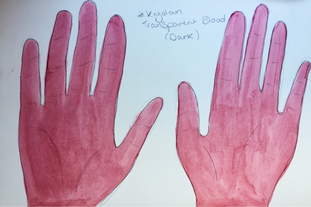
- Kryolan Transparent Blood (dark)
Consultation Notes:
Skin Type: Combination
Skin Sensitivities: None
Current Skin Care Regime: Daily cleanse, tone and moisturise.
Allergies: None
Skin Disorders: None
Contact Lens Wearer: No
Design
Above is the face design for my Mrs Laderman character. In the 80s, design typically included black, neon, primary colours, pastel colours and geometric shapes (as shown and discussed on my mood board for this character). From this, I chose to follow this as a guideline, but decided to scrap the neon aspects as I felt this is seen as too 'trashy' for my character due to her age and glamours way of living. Therefore, I included black in the eye make-up with black eyeshadow. I made the black harsh on her eyelid but well blended above the lid/below the brow as this was typically done in the 80s era. As my character is set in modern times, just influenced but the 80s (her prime time), I decided to leave out the bold use of blusher, particularly as I didn't want my character to look comical. I chose a bold red lip, which compliments the smokey eye and will also contrast with the pastel colours which I plan to incorporate in my character's styling/costume. I decided hoop earrings were essential as part of my design as it allowed me to incorporate geometric shapes in a way that is subtle but also modern. I also included strong eyebrows and long lashes in my design as this was beauty ideal in the 80s. I decided on messy curls for my design as I felt this would flatter my model's round face shape and also be very typical of the 80s era, particularly as perms were big around this time. As my character is in a scene where she is searching Claudia's house, I decided to add a part where there is tension when Mrs Laderman breaks something and risks waking Claudia up. In her desperation to quickly fix the broken glass, she cuts her hand by accident.
Character 1: Claudia - Final Images and Evaluation


Evaluation
Overall, I am quite happy with the final outcome of this character for the project. I feel that the combination of the hair, make-up and costume ties together nicely and creates the type of typical preppy look that I had aimed to achieve. I feel that the use of blood in my design really helps to create the 'cute but psycho' character type I had wanted. I feel that the weakest element of my outcome was the application of the blood. I would like to have achieved larger splatters of blood and should have taken the time to research and experiment with the different ways for this to be done to make it stronger in appearance. I am also not happy with the shade of blood that I used, and would have liked to have gone for a medium shade instead of dark as I feel the dark is too purple-based instead of red. I also feel that my use of cat-eye make-up didn't give her the sinister expression that I had hoped and instead made her eyes look wider and friendlier. I expect this could be solved by making the flick come out straight rather than a upwards angle to do this.
My favourite part of the outcome is the hair, as it suits my model very well and really adds to the character by being feminine and detailed and creates a juxtaposition of the darkness of the blood and innocents of her appearance.
Monday, 4 April 2016
Character 1: Claudia - My Final Design
Products Used (in order):
- Illamasqua's Matte Primer
- Kryolan Ultra Foundation
- Kryolan Concealer Palette
- Illamasqua Translucent Powder
- Kryolan Glamour Glow Palette
- Benefit Brow Zing
- Mac Cool Neautral Palette
- Max Factor 2000 Calorie Mascara
- Kryolan Creme Liner
- Kryolan Lip Palette
- Kryolan Transparent Blood (dark)

Consultation Notes:
Skin Type: Combination
Skin Sensitivities: None
Current Skin Care Regime: Moisturises daily
Allergies: None
Skin Disorders: None
Contact Lens Wearer: No
Design
Above is my design for my Claudia character. For my design, I wanted my character to look very feminine as she is influenced by TV shows, and currently the show 'Scream Queens' and therefore has a preppy style. I felt that using pink colours in my design would translate this chosen style well, which made me decide to incorporate the colour in both her styling and her make-up to compliment each other. After experimenting with different feminine eye make-up, I decided on a cat-eye as this makes her eyes look more sinister yet empowered, to suggest her strong personality. I decided on a hairstyle that, again, is feminine, but I also wanted it to be a style that Claudia could realistically do on herself as she lives alone. I wanted my model's skin to look fair and not tanned due to her very rarely leaving the house, despite the hot climate of Miami. Lastly, I added the blood on her face to contrast against pretty and feminine aspects of my character after she commits a murder. I felt this would work well against her appearance and shows the audience that you can't judge a book by it's cover. I wanted the blood to look like it was splattered on her face, as it may be expected after frantic stabbing. I also wanted her hands covered in blood and a bloody hand print on her face to look like she accidentally touched her own face without realising the blood on her hands due to her zoned out state after realising what she has done. I also felt the bloody hand print allowed me to add more blood to the face as the splatters alone did not create enough impact on their own. I also felt the use of blood splatters would be a great edition due to Blood Splatter Analysis being a key theme to the show due to it being Dexter's profession.
Wednesday, 16 March 2016
Project Progression Evaluation (Brief 1)
Overall, I am quite happy with the outcome of this project. Although at first I found the continuity aspect of the brief to be a stressful thought, I found that when doing it, I did it with much more ease than I had anticipated. My favourite part of the brief was coming up with a design. I was advised at the beginning of the project that as I had chosen to do a Vampire character, that I should aim to not do something expected, which I feel I have achieved.
Within my design, I decided to use a prosthetic piece. I have some experience in prosthetic application, and decided to further my skill by braving it. I felt a prosthetic would be logical for this specfic brief as it makes continuity even more achievable. I found it dificult at first to source the prosthetic I was looking for, but after some research, found a seller who was willing to make 3 pieces for me (1 for practice and 2 for the seperate assessments). Another hard aspect of this was achiving exact placement each time, even with continuity photos.
For the hair element of the assessment, I found that timing was one of my hardest aspects. Although I am fairly confident with styling hair, I am not very good with time management. I felt that my lack of confidence with achiving a detailed hairstyle in assessment conditions held me back and made me play it safe with my design.
Monday, 14 March 2016
Assessment Part 2/2 Evaluation and Photos


Overall, I am quite happy with the outcome of my second assessment. Last time, I feel the red looked slightly more subtle on the eyes and lips. I also feel that the prosthetic was slightly lower down and more central compared to the first time. It was also slightly better blended which meant it had looked more effective. The skin was also slightly more matte and the contour was slightly stronger.
This time around, my model washed her hair on the day of the assessment, rather than the day before, and this seemed to make the hair lift much better from the heated rollers. Therefore, the hair appears fuller and more lifted and different to last time.
For my second assessment, I took into consideration to make the clothes the same - Same shirt, bow and earrings. I feel this additions have helped to create a similar appearance to the previous assessment.
For the taking of my final photos, I used a different studio which created slightly different lighting and angle.
During the assessment, I found my continuity photos very helpful, particularly with hair placement to help it sit in a similar way. My design helped me to remember areas that require shading and highlight to help match with the prosthetic. I feel that my application techniques were very similar to my previous assessment which meant that I recreated this design with ease.
Assessment Part 1/2 Evaluation and Continuity Photos


Overall, I am quite happy with how my part 1/2 assessment went. I carried out my techniques as planned which meant that the look was how I pictured it to look overall.
I am very happy that my look was able to be completed to the standard that I had hoped as in previous practices I had not been able to fulfill this aspect successfully.
During the assessment, I had some trouble with the neatness and placement of the hair as one side looked different to the other, which I attempted to fix but resulted in making it slightly worse. I would have been better off taking the hairstyle out completely instead of attempting the problem with it still half styled.
I am not overly pleased with how the sides of the hair looked as they are inconsistent in appearance; although, I will admit that the layering of the hair itself had added to the issue but this should have been something that I had taken more time on.
After seeing other student's work during the assessment process, I have come to the conclusion that maybe at this stage that my design was quite adventurous and although I wanted to have fun with this project, I could have maybe gone with a design of equal impact but maybe a little more simplicity. This may be something worth me personally noting in the future.
When looking at the side profile pictures, I feel that my contouring approach was too strong, but I had wanted a defined look to compliment the prosthetic. Despite this, I will endeavour to recreate the appearance as the focus of this project is continuity.
One of my most frustrating elements of the design is the forehead prosthetic - although I used exactly the same product to colour with as the base, not matter what I did, it looked considerably lighter to the rest of the face which I feel dramatically decreases it's effectiveness. The colour under the prosthetic is a much lighter and more yellow type of tone to my model's skin which is the main cause of this issue, but I felt regardless of the thickness of the application, it stayed this way. How to overcome an issue such as this is something I will need to investigate into if I plan to use latex-based prosthetics in the future.
Final Design Breakdown
Make-up Design

Product List:
Illamasqua Matte Primer
Kryolan Ultra Foundation
Kryolan Concealer Palette
Illamasqua Translucent powder
Kryolan Liquid Latex
Kryolan Cinewax
Kryolan Supracolor (red)
Rimmel Mascara
Kryolan Glamour Glow Palette
Latex Prosthetic Piece (Forehead)
Dental Prosthetic Piece (Fangs)
Design
In my design, I have decided to go for a natural but pale skin tone as I feel that this is more suited film as it gives a more natural and realistic finish to the overall complexion. I found using a white greasepaint made my previous design look theatrical and too bold for a HD camera and would have looked almost comical.
I have chosen a matte primer as my model has a combination skin type and any shine would be obvious on a HD camera and also give away that presence of make-up on the skin. I will be using darker shades of foundation to contour with over powder as this is much lighter in consistency and therefore more natural in appearance. The absence of base make-up is important to my character as not only is she set in the Victorian era, where make-up was taboo, she was also a vampire, a mythical creature, therefore make-up application in her animalistic-like state would not be something on her agenda.
I wanted design for the scene where she is seen as a Vampire and feeding, therefore I added red tones to the lips and around the eyes to give a subtle hint of life and colour to her face as she would be in health prime as a Vampire as a feed, while also mainitaining a ghostly complexion.
In the book, when she is first seen as her vampire self, it is something that is instantly recognisable and distinctively different from her human self. I felt that by adding something that looks like it is between a human and an animal to the face would really help to define her in her vampire form. Therefore, I chose my forehead/brow prosthetic. This gives her a fierce and angry expression which therefore makes her scary to look at. The distinctive lines and depth ensure that it is too unusual to be human.
I lastly finished my look with a pair of fangs. I chose this style of fangs as I felt it that these are the types of fangs that would produce the puncture marks in the neck that is described in the book. Fangs that are on the canine teeth would be too far apart to and large to create it.
To add depth to my prosthetic, I used dark foundation tones. I wanted the prosthetic to match the rest of the face and not look out of place, therefore I used these same tones to contour with, to add the same type of depth and colouring to make the look continuous.
I also used a light amount of black mascara on the eyelashes to bring my look together as I felt that the overall appearance was too pasty and undistinctive without extra definition to the eye area and also meant that there was too much focus on the depth of the prosthetic, therefore I felt this was needed.
The reason I chose a prosthetic piece over creating a similar effect with Cinewax or a similar product is that I felt that this was most suitable for continuity as it can be remade over and over the same every time using a mold with the same outcome every time.
Hair

For my hair design, I decided to go with a neat plaited bun design which was inspired by the plates I had gathered from Richard Corson's 'Fashions in Hair' book from 1870 to 1900 which I have discussed on this page and is the era in which my book is set. I felt that the front section of the hair would provide a feminine touch as my character is described as pretty and feminine. I also found that with this, it would give me the ability to further camouflage the edges of my prosthetic due to it's placement which would increase the overall effectiveness of my design. Due to it's distinctive appearance but simple required techniques, I felt that this hairstyle would be doable when recreating it for continuity.
Technical File - Step by Step of my Assessment, Practice on Myself and a Product List


Product List:
Hair:
Denman brush
Pintail Comb
Bobby pins (dark brown)
Thin hairbands (dark brown)
Heated Rollers
Hairspray
Sectioning clips
Make-up:
Pre-made, pre-painted Latex Prosthetic
Cleanser, toner, moisturiser
Illamasque Matte Primer
Kryolan Cinewax
Kryolan Liquid Latex
Kryolan Creme Foundation Palette
Kryolan Supracolor (Red)
Illamasqua Translucent Powder
Rimmel Long Lasting Mascara
Dental Fang Prosthetic
Step by Step
- Remove any make-up that my model has on by cleansing, toning and moisturising. Allowing it to soak into the skin while I move on to the hair.
- Section the front half of the hair and clip it forward to separate it from the back.
- Take the back section of the hair and put it a neat ponytail on the center of the back of the head.
- Plait the pony tail and tie it off with hair band.
- Twist the plait around on itself, into a bun shape and secure it with bobby pins.
- Part the front section of the hair down the middle and directionally set the hair with heated rollers.
- While the rollers cool and set, begin the make-up.
- Apply a matte primer on the skin (I will use a foundation brush for this to maintain good cleanliness).
- Apply Cinewax on to the eyebrows and smooth it down with a spatula (this is to protect the eyebrows from adhesive and to flatten any areas that are not covered by the prosthetic).

- Apply an adhesive around the edges of the prosthetic. For my assessment I chose to use liquid latex as it's easy to remove and works well my with my thin latex based prosthetic and a heavy duty one is not necessary.

- After leaving the liquid latex after a short time to allow it to get slightly tacky, I apply the prosthetic to the face, so the the bottom middle sits just above the bridge of the nose and the sides sit just before the crease of her eyelids to ensure her eyes can still open with ease and is comfortable and central.

- Once the liquid latex is dry and the prosthetic is stable, I blend out the edges with liquid latex and a cotton bud to make it a smoother transition from the prosthetic to the skin. I then dry this with a hairdryer.

- I then apply my base make-up (Kryolan creme foundation) all over the face and over the latex edges and partially on to the pre-painted prosthetic to further help with blending.
- I then use darker shades of foundation (which were also used on the prosthetic) to add depth and contour the face which I blend out thoroughly but try to match the visual impact of the prosthetic to help it to not look out of place.

- I then powder over the whole base using Illamasqua translucent powder to set it.

- I then apply Kryolan red greasepaint on the the lower and upper eyelids and the lips which I blend with my finger to give it a natural appearance which I then set with translucent powder too to avoid creases.

- Lastly, I apply a light amount of black mascara on to the lashes to add a bit of subtle depth to the eyes.
- Once the make-up is complete, I move back on to the hair where I remove the heated rollers and lightly dress out the hair.
- Using a pintail comb, I encourage the sides of the hair wave forward towards the face at the sides to cover the sides of the prosthetic to further help camouflage it while also looking very true to the late Victorian look.
- I then pin the ends of the hair to sit over the ears and back into the bun which I secure with bobby pins.
- Lastly, I ask my model to put in her dental fang prosthetic on to her teeth to finish of the vampire look.


Saturday, 12 March 2016
Technical File - Consultation Notes of my Model
Name: Jennifer Barry
Skin Type: Combination
Known Allergies: None
Sensitive Skin: Yes
Contact Lens Wearer: No
Skin Disorders: None
Scalp Conditions: None
Subscribe to:
Posts (Atom)