Wednesday 20 April 2016

Bibliography


Books:
Corson, R. (1965). Fashions in hair. New York: Hastings House.
Corson, R. (1972). Fashions in makeup. New York: Universe Books. 
Stoker, B. (1996). Dracula. Charlottesville, Va.: University of Virginia Library.
Mulvey-Roberts, M. (1998). The handbook to Gothic literature. Basingstoke, Hampshire: Macmillan.
Killeen, J. (2009). History of the Gothic. Cardiff: University of Wales Press.
Stevens, D. (2000). The gothic tradition. Cambridge: Cambridge University Press.

Film:
Dracula. (1992). [DVD] United States: Francis Ford Coppola.
Excision. (2012). [film] United States: Richard Bates Jr.
Twilight. (2008). [film] United States: Catherine Hardwicke.
Fright Night. (1985). [film] US: Tom Holland.
Interview with the Vampire: The Vampire Chronicles. (1994). [DVD] US: Neil Jordan.
Nosferatu: A Symphony of Horror. (1922). [film] Germany: F.W. Murnau.
From Dusk Till Dawn. (1996). [film] US: Robert Rodriguez.
30 Days of Night. (2007). [film] US: David Slade.

Other:
True Blood. (2008-2014). [Tv Series] US: Alan Ball.
You're a Germ - Wolf Alice. (2015). [Music Video] US: Chris Grieder.

Saturday 9 April 2016

Project Progression Evaluation (Brief 2)

Overall, I felt that I had particularly enjoyed this brief. I feel that a large part of this is due to there not being a timed assessment. For me, a timed assessment is one of the hardest aspects of a brief. Although being under time restraints is something I would have to be used to in the industry, I felt this allowed me to focus more on what I wanted to do creatively instead of what I felt would be achievable in the given time.

One of the most helpful aspects of this project was my presentation, as it allowed me to get feedback from my teacher, which made me realise I had spent too much time creating the appearance of my character, that I had overlooked incorporating a special effect into the design.

The hardest material I worked with was sfx transparent blood. I struggled to come up with a way that I could use it to create a splatter effect on my character, without ruining the clothing or getting it on things around my model or the floor. In the future I will need to look into more ways to be able to control the product.

My most successful material that I used in the project was Cinewax. The first few times that I had practiced with this product, I felt the blending almost impossible to achieve. When I used it for this project to create my cut, I felt that I had perfected my technique and was very happy with the outcome.

(255 words)

Thursday 7 April 2016

Character 2: Mrs Laderman - Final Images and Evaluation


Evaluation

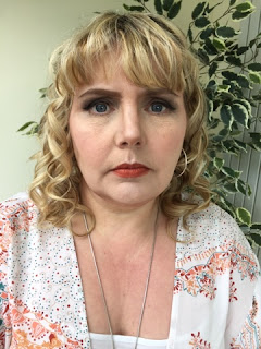
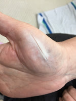
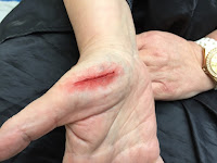
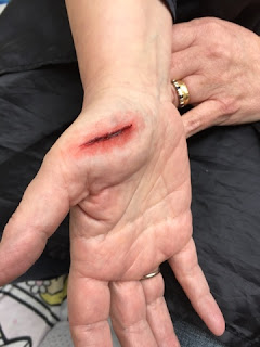
Overall, I am very happy with the outcome of this part of the project. I feel that the combination of hair, make-up and clothing help to create my motherly character with an 80s Miami aesthetic influence. I feel that the make-up is the biggest key to an 80s influence, with strong eyes and lips which I feel accentuate my model's features well. I feel that the messy curls are at a good medium so that they don't look out of place or over the top and balance well with the make-up. For the styling, I decided to focus bright and light clothing that would be suitable to the Miami climate and the use of details and jewelry help to suggest the character's wealthy past. For the location, I chose a well-lit living room, with natural sunny lighting and light colours, which is supposed to be Claudia's house in Miami which Mrs Laderman is searching which I felt was appropriate. I am pleased with the outcome of the injury, as because it was glass that cut it, it is a deep clean line cut which can be seen that it was done with something very sharp. If I were to create this again, I would like to purchase FX glass and add glass to the injury.

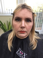
Character 2: Mrs Laderman. Step by step.

Products Used (in order):

  • Benefit's 'Porefessional' Primer
  • Kryolan Ultra Foundation
  • Kryolan Concealer Palette
  • Illamasqua Translucent Powder
  • Kryolan Glamour Glow Palette
  • Benefit Brow Zing (Medium)
  • Mac Cool Neautral Palette
  • Benefit 'Roller Lash' Mascara
  • Kryolan Creme Liner
  • Kryolan Lip Palette
  • Kryolan Cinewax
  • Kryolan Supracolor (Red and Black)
  • Kryolan Transparent Blood (dark)

Step by Step:

 1. First, I prepared the skin using cleansing, toning and moisturising. I then applied Benefit's 'Porefessional' primer to help reduce the appearance of fine lines in the make-up.

 2. I then applied the base, which I firstly used Kryolan's Ultra foundation and conealer from the concealer palette. I blended this in well with a kabuki brush before setting it with Illamasqua's Translucent Powder to prevent the fine lines from being visible. I then warmed up the skin tone and contoured the face using bronzer, highlighter and blush from the Kryolan Glamour Glow Palette.

 3. I filled in and shaped the eyebrows using Benefit's 'Brow Zing' and an angled brush.

 4. I created a soft smokey eye using black, dark brown, light brown and white shades from the Mac 'Cool Neautral' palette.

 5. I then applied Kryolan's Creme Liner in Ebony and Benefit's 'Roller Lash' Mascara on the lashes.

 6. I then applied a orangey-red lipstick to the lips (Kryolan's Lip Palette) as I felt this particular shade of red complimented my model's skin tone.

 7.  I curled the hair all over, alternating in direction. using a curling wand which I loosely teased out with my fingers and hairsprayed.

 8. I then moved on to the cut hand, which I firstly applied and blended the edges of Cinewax and cut down the middle with a spatula.

 9. I then applied red greasepaint around the cut with a soft brush for a light application. I then used a small refined brush to add red inside the cut.

 10. I then applied a small amount of black greasepaint inside the cut with a small refined brush and then used to same brush to add dark transparent blood inside the cut.

Health and Safety:
  • Decant all product on to a palette before use.
  • Make sure all electrical equipment is PAT tested.
  • Use spray products such as hairspray in a well ventilated room.
  • Use disposable wands when applying mascara.

Evaluation of practice:

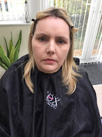
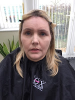
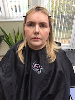
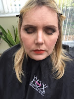
Overall I am very happy with the outcome of this practice. The one thing I would change about the overall look is that I would concentrate more on an even application of the eyeshadow above the eyelid so that the colour is more consistent. The thing I am happiest with the most is the cut on the hand, although like the eyeshadow, I would like the colour application to be slightly more consistent/smooth.

Character 2: Mrs Laderman - Final Design


Products Used (in order):

  • Benefit's 'Porefessional' Primer
  • Kryolan Ultra Foundation
  • Kryolan Concealer Palette
  • Illamasqua Translucent Powder
  • Kryolan Glamour Glow Palette
  • Benefit Brow Zing (Medium)
  • Mac Cool Neautral Palette
  • Benefit 'Roller Lash' Mascara
  • Kryolan Creme Liner
  • Kryolan Lip Palette
  • Kryolan Cinewax
  • Kryolan Supracolor (Red and Black)
  • Kryolan Transparent Blood (dark)

Consultation Notes:

Skin Type: Combination

Skin Sensitivities: None

Current Skin Care Regime: Daily cleanse, tone and moisturise.

Allergies: None

Skin Disorders: None

Contact Lens Wearer: No


Design

Above is the face design for my Mrs Laderman character. In the 80s, design typically included black, neon, primary colours, pastel colours and geometric shapes (as shown and discussed on my mood board for this character). From this, I chose to follow this as a guideline, but decided to scrap the neon aspects as I felt this is seen as too 'trashy' for my character due to her age and glamours way of living. Therefore, I included black in the eye make-up with black eyeshadow. I made the black harsh on her eyelid but well blended above the lid/below the brow as this was typically done in the 80s era. As my character is set in modern times, just influenced but the 80s (her prime time), I decided to leave out the bold use of blusher, particularly as I didn't want my character to look comical. I chose a bold red lip, which compliments the smokey eye and will also contrast with the pastel colours which I plan to incorporate in my character's styling/costume. I decided hoop earrings were essential as part of my design as it allowed me to incorporate geometric shapes in a way that is subtle but also modern. I also included strong eyebrows and long lashes in my design as this was beauty ideal in the 80s. I decided on messy curls for my design as I felt this would flatter my model's round face shape and also be very typical of the 80s era, particularly as perms were big around this time. As my character is in a scene where she is searching Claudia's house, I decided to add a part where there is tension when Mrs Laderman breaks something and risks waking Claudia up. In her desperation to quickly fix the broken glass, she cuts her hand by accident.

Character 2: Mrs Laderman - Initial Designs + Feedback


Above is my initial designs that I had included in my presentation.

Idea 1 - For this design I went for a make-up that was quite simple as I was going to make the hair the main focus of the design. Bold lips, simple eyes and voluminous sweeping hair for a subtle hint of the 80s. After completing my design, I considered how I could take it further with more interest and more of an obvious nod towards an 80s influence.

Idea 2 - Here I toned down the hair slightly and created a bold, strong 80s eye. After drawing up my design, I realised this would probably look too over the top and comical for my character and that I would need to reconsider my '80s' approach in a way that would create a happy medium.

Idea 3 - After looking at 80s Madonna for influence due to her being an icon, I realised that the late 80s featured a more smokey eye effect which creates a strong impact without the extreme bright colours around the eyes seen in the early part of the era. After considering the fact that my model has a fringe, I decided to go for the strong messy curls as seen on late 80s Madonna which I felt complimented my model's own hair. From this the hairstyle is easy to approach with styling, compliments the overall look and has a good impact. I included hoop earrings in my design as drawing it inspired me to include this in the styling to complete the look.


http://www.kurs-makijazu.pl/z-makijazem-przez-wieki/. (2015). [image] Available at: http://Madonna Hair [Accessed 7 Apr. 2016].

80s Madonna Make-up. (n.d.). [image] Available at: http://www.simplyeighties.com/madonna-fancy-dress.php [Accessed 7 Apr. 2016].


Character 2: Mrs Laderman. Mood board.


In this mood board, I have chosen to use strong 80s themes, as well as Miami vice, gangster and femininity. This board focuses heavily on the aesthetics of my character. I want my character to look bold, strong and glamourous. For this board, I am going to talk through each of the images and discuss what I feel they reflect for my character:

(Left to right, top row)
1.A neon sign is very typical for 80's Miami. I like the colours used, they are bold but not too bright and harsh which is something I would like for my character. Due to my character being an ex-mobster wife, I feel that the name 'Tony's' seems like a very likely name for a place the gangsters of such era would own as a way to justify their income to the government as a cover-up to their actual money earning ways.
2. I like this graphic image for it's shapes and use of colours as it's very typically 80s. I would like to incorporate such shapes and colours for not only the hair and make-up but also the styling for my character. Geometric shapes such as these could be easily added with something simple such as hoops earrings.
3. I found this 80s make-up advertisement to be interesting as it's a very bold reflection on the beauty ideals of the era and also the shapes and blending styles of the make-up of that time. Although the make-up of my character won't be like this, it will have subtle influences due to her adapting to modern times.
4. I chose this image as I liked the use of bold colours mixed with pastel colours in a way that somehow works. I also felt it continued the mood of the board.

(Left to right, bottom row)

1. I liked this Miami Vice poster as it's a literal representation of the mood of my character: 80s, gangster and Miami.
2. I chose this image of Debbie Harry/'Blondie' as I see her as one of the key icons of the era. I really like the soft and well blended use of make-up that is used, as well as the chosen colour palette of pastel pinks.
3. I chose this interesting image as I really like the use of Marilyn Monroe, someone who is the epitome of glamour, which contrasts with the use of tattoos and a gun. This 'glamorous gangster' character that is created similar to the one in which I am aiming to create.
4. Lastly, similarly to the second image of the top row, I chose this one for the shapes and colours that are used, and want to focus on this pastel take on 80s fashion.  

Character 2: Mrs Laderman

Chosen Inspirational Word: Awakening

I chose the word 'Awakening' because I felt that it reflected what my character is going through. As she is suspicious about Claudia committing a murder, she has suddenly become fearful and aware of her surroundings as she no longer feels safe and feels she has a duty to prevent Claudia from committing another.

The key word has helped me to investigate strong female characters who are put in fearful situations where their aim is to protect themselves and others. I have looked at how they are represented as mother-like yet strong through their hair, make-up and clothing:


Character 2: Mrs Laderman

Red, Orange is the New Black. (n.d.). [image] Available at: http://tvnz.co.nz/orange-is-the-new-black/galina-red-reznikov-6061527 [Accessed 7 Apr. 2016].

Pulp Fiction. (n.d.). [image] Available at: http://ourgoldenage.com.au/film/pulp-fiction/ [Accessed 7 Apr. 2016].


For my Mrs Laderman character, I am going to have her as someone who is suspicious of her neighbour, Claudia. Mrs Laderman is aware that Claudia is not mentally well due to her agoraphobia, but has reason to be suspicious that her illnesses go beyond that. She has agreed to keep Claudia in the know about the outside world in order to keep her close to keep an eye on her.

As an individual, Mrs Laderman is an ex mobster wife, who's husband's death is not discussed. She lives in Miami, where she has lived most of her life. Due to her past, Mrs Laderman was big in the Miami scene back in the 80s, where her ex husbands profession provided her with a lavish lifestyle when she was young. Mrs Laderman is nostalgic of the past and her hair, make-up and clothing choices are influenced from this time, where she remembers herself as her happiest.

As a large part of the audience demographic is older women, typically around 40, they may find this character type relatable and even find the nostalgic influences in themselves. As Mrs Laderman is a mother-type figure to Claudia, the relationship between them will be very familiar.

The scene I will be putting this character in is one where she is snooping around Claudia's house while Claudia is upstairs asleep. Her aim is to settle her suspicious that Claudia may have committed a murder. While she is doing this, she accidentally knocks over a glass ornament and cuts her hand trying to pick it up.

Character 1: Claudia - Final Images and Evaluation


Evaluation


Overall, I am quite happy with the final outcome of this character for the project. I feel that the combination of the hair, make-up and costume ties together nicely and creates the type of typical preppy look that I had aimed to achieve. I feel that the use of blood in my design really helps to create the 'cute but psycho' character type I had wanted. I feel that the weakest element of my outcome was the application of the blood. I would like to have achieved larger splatters of blood and should have taken the time to research and experiment with the different ways for this to be done to make it stronger in appearance. I am also not happy with the shade of blood that I used, and would have liked to have gone for a medium shade instead of dark as I feel the dark is too purple-based instead of red. I also feel that my use of cat-eye make-up didn't give her the sinister expression that I had hoped and instead made her eyes look wider and friendlier. I expect this could be solved by making the flick come out straight rather than a upwards angle to do this.
My favourite part of the outcome is the hair, as it suits my model very well and really adds to the character by being feminine and detailed and creates a juxtaposition of the darkness of the blood and innocents of her appearance.

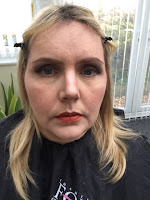
Character 1: Claudia. Hair & Make-up Step by step.

Products Used (in order):
  • Illamasqua's Matte Primer
  • Kryolan Ultra Foundation
  • Kryolan Concealer Palette
  • Illamasqua Translucent Powder
  • Kryolan Glamour Glow Palette
  • Benefit Brow Zing
  • Mac Cool Neautral Palette
  • Max Factor 2000 Calorie Mascara
  • Kryolan Creme Liner
  • Kryolan Lip Palette
  • Kryolan Transparent Blood (dark)


Step by Step:

 1. First, I prepared the skin by cleansing, toning and moisturising. I then used Illamasqua's matte primer.

 2. After, I applied Kryolan's ultrafoundation over the face and neck using a foundation brush and then blended it with a kabuki brush. I concealed any dark shadows and imperfections with kryolan's concealer palette. I then powdered over the face with Illamasqua's translucent powder. I contoured the face using Kyrolan's Glamour Glow where I applied a natural amount of bronzer, highlight and blush.

 3. I filled in the eyebrows with Benefit's 'Brow Zing' in the shade 'medium'/
 4. I applied eyeshadow with a cat-eye effect using black, dark brown, light brown and white from the Mac Cool Neautral palette, creating a ombre effect.

 5. I applied mascara on the top and bottom lashes using Max Factor's 2000 Calorie Mascara. I then applied Kryolan Creme Liner in Ebony.

 6. I applied a soft pink shade of lipstick to the lips, using Kryolan's Lip Palette.
 7. I then started with the hair, which I created by back-combing the front of the hair, parting it down the middle at the back. Then I plaited the two halves, crossed them over the top of the head and pinned them together.

 8. I then took the two strands that I purposely left out, and curled them using a curling wand.

 9. I then applied blood to my model's hands and spattered blood on her face using a brush. I then finished off by applying blood to my own hand and making a blood print on her face. This is the finished look.


Health and Safety:
  • Decant all product on to a palette before use.
  • Make sure all electrical equipment is PAT tested.
  • Use spray products such as hairspray in a well ventilated room.
  • When flicking product on to the face, ensure model's eyes and mouth are closed during.
  • Use disposable wands when applying mascara.
Evaluation of practice:

Overall, I am very happy with my practice and the outcome. In the future I will work on ensuring the eye make-up and eyebrows are more even to refine the look.

Monday 4 April 2016

Character 1: Claudia - My Final Design

Products Used (in order):
  • Illamasqua's Matte Primer
  • Kryolan Ultra Foundation
  • Kryolan Concealer Palette
  • Illamasqua Translucent Powder
  • Kryolan Glamour Glow Palette
  • Benefit Brow Zing
  • Mac Cool Neautral Palette
  • Max Factor 2000 Calorie Mascara
  • Kryolan Creme Liner
  • Kryolan Lip Palette
  • Kryolan Transparent Blood (dark)


Consultation Notes:

Skin Type: Combination

Skin Sensitivities: None

Current Skin Care Regime: Moisturises daily

Allergies: None

Skin Disorders: None

Contact Lens Wearer: No


Design

Above is my design for my Claudia character. For my design, I wanted my character to look very feminine as she is influenced by TV shows, and currently the show 'Scream Queens' and therefore has a preppy style. I felt that using pink colours in my design would translate this chosen style well, which made me decide to incorporate the colour in both her styling and her make-up to compliment each other. After experimenting with different feminine eye make-up, I decided on a cat-eye as this makes her eyes look  more sinister yet empowered, to suggest her strong personality. I decided on a hairstyle that, again, is feminine, but I also wanted it to be a style that Claudia could realistically do on herself as she lives alone. I wanted my model's skin to look fair and not tanned due to her very rarely leaving the house, despite the hot climate of Miami. Lastly, I added the blood on her face to contrast against pretty and feminine aspects of my character after she commits a murder. I felt this would work well against her appearance and shows the audience that you can't judge a book by it's cover. I wanted the blood to look like it was splattered on her face, as it may be expected after frantic stabbing. I also wanted her hands covered in blood and a bloody hand print on her face to look like she accidentally touched her own face without realising the blood on her hands due to her zoned out state after realising what she has done. I also felt the bloody hand print allowed me to add more blood to the face as the splatters alone did not create enough impact on their own. I also felt the use of blood splatters would be a great edition due to Blood Splatter Analysis being a key theme to the show due to it being Dexter's profession.

Character 1: Claudia - Initial Designs + Feedback


Above is my initial design ideas and then my final idea that I had decided on for my class presentation.

Idea 1 - for my first idea, I went for a simple feminine hair and make-up as I felt it closely fitted with how the characters from Scream Queens might typically look. 

Idea 2 - After looking at it, I decided that I would like to do something with the hair that was a bit more visually interesting as well as a bit more preppy. I felt adding adding a very subtle smokey eye might make her more sinister in appearance. After looking at it, I realised that although it fitted with my intended type of visual outcome, it still looked too pretty and innocent and I was going to have to go with with something a bit more dramatic with the eyes if I want my character to have a sinister look.

Idea 3 - I decided that winged smokey eye makes a much better impact to the eye shape to help it look more mysterious and slightly less girly, to suggest something is up.


Feedback:

As my initial intended scene for my character would be an establishing one, my designs included no special effects which is something that is essential to the brief. My teacher advised my that I find a way to include some special effects, therefore I decided to change my character's scene to a post-murder one, which meant I would have more of a open approach.

Character 1: Claudia. Mood board.


In this mood board, I have red, white and pink throughout. Firstly, red because I am designing my character after she has brutally murdered her boyfriend. Therefore, she will be covered in blood on her face, as will her hands. Secondly, I have chosen white as a suggestion of purity. Before the murder, the character is sympathised with. Although she is sometimes controlling in behaviour, the audience is made to understand that she is anxious of the world and a lost soul. She is innocent as a whole, but we later find she had a very dark side to her that initially only. suggested. Only later do we see it's full potential. I have also chosen pink as this ties in with the white. Pink is typically a cute colour and one I plan to have her wearing when she commits her murder. The pink also reflects her preppy side which she has adapted through watching a lot of American tv and has created an idealised version of herself.

A lot of my chosen images are ones which I feel reflects the contrasting sides to Claudia's personality. I particularly found this in cute or well presented human forms with something disturbing such as weapons or blood with it. My favourite image amongst these is the top left where there is a woman in a pink and well-fitted dress with complimenting accessories holding a chainsaw. I feel like this is a literal representation of my Claudia character.

Character 1: Claudia

Chosen Inspirational Word: White Rose


I chose the word 'White Rose' as I felt it reflected the innocent appearance that I want for my character. My reason for wanting my character to look this way is 1) the audience will not understand her complex psychotic tendencies from appearance also 2) because she doesn't perceive herself as a bad person. From this key word, I was inspired to look at existing films and Tv series where there is a psychotic or manipulative female role who is innocent in appearance:


When designing and planning for my character, I will have her in a scene where she just committed her first murder. A female who she had decided was involved with her boyfriend Quentin (although the audience will know that this is definitely not true as he is imaginary). From this, she will have blood splatters on her. Aside from this, she will have her typical type of hair and make-up: feminine, preppy, but with a slight change that makes her slightly more sinister in appearance to her usual type, most likely through her eye make-up.

Character 1: Claudia

Scream Queens. (2015). [image] Available at: http://www.hercampus.com/sites/default/files/2015/10/25/poster-de-scream-queens_1.jpg [Accessed 4 Apr. 2016].

The way that I will incorporate this character is by having her as one of Dexter's serial killer victims
My only adaptation to the given character description is that my character is into Horror Tv series as well as Horror films as this leaves her current influence/obsession more open.
From this, I have decided to make the character's current Horror Tv Show fascination to be Scream Queens. The visual aesthetics of the main character's in this series is very girly, preppy and pristine which I will incorporate into the appearance of my character.
Although my series is set in Miami, my character will not be influenced by this as she is agoraphobic, therefore she doesn't go outside and would not need to adapt to the hot climate, especially as houses are generally air conditioned.
Because there is a younger part of the age demographic for the Dexter series, her appearance and interests will be based on current trends and popular media.

Sunday 3 April 2016

Production Mood board


Above is a mood board that I created to reflect the mood and themes of my chosen series, 'Dexter'. My mood board focuses on the three main topics of the series: crime, death and blood. In the series, blood splatters are a reoccurring topic. I have therefore chosen images of different ways that blood and blood splatters are addressed, and the emotions that they provoke. In some cases, the use of blood is used in a sexual manner. Blood is often used spilled over intimate areas on a human body, most likely used to provoke conflicting feelings about an image. Blood is seen as such a gruesome and traumatic medium, yet it is used as a way to appreciate the human form in a male-gaze type manner - a typical audiences fears and fantasies combined. My top left photography image and my middle second from the left catwalk image gives inspiration to this idea and suggestion. I feel that this approach to feelings about blood is something that subtly but often occurs in the Dexter series. The rest of my chosen blood images are various ways that blood is addressed artistically but also it's like to police and crime.

In the series, I feel that the location is very important, and is deliberately used as part of a series of such dark topics. From the series being set in Miami, the audience almost fantasizes about Dexter's serial killer life, as he seems to have it all. Dexter lives in a idyllic home surrounded by sun, beaches and a general holiday type mood. Dexter works as part of an FBI team, which in America is a particularly well respected position. Despite all of this, every aspect of Dexter's life is dark and often disturbing. This is why I have chosen darkly lit pictures of the beach and palm trees to reflect how this is done.

Lastly, I have included a darkly lit photographic picture that suggests someone suffocating and also a graphic crime scene. I chose these images as they reflect how the killing in Dexter is typically done. As it's reoccurring through the majority of the episodes, I felt this was important as part of setting the mood.

Saturday 2 April 2016

Brief 2: Claudia and Mrs. Laderman - My Chosen TV Series: Dexter

Dexter Promotion. (2013). [image] Available at: http://horrorpedia.com/2013/07/29/dexter-tv-series/ [Accessed 24 Mar. 2016].

 
Dexter Behind the Scenes. (2014). [image] Available at: https://uk.pinterest.com/pin/322640760775824468/ [Accessed 24 Mar. 2016].

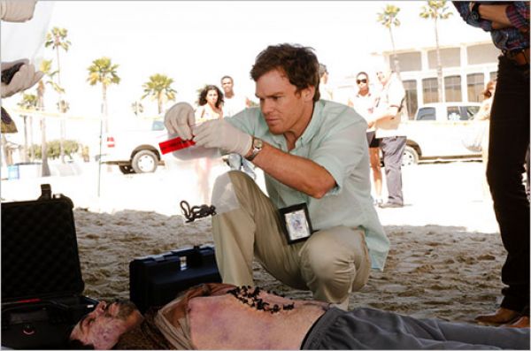
Dexter Scene. (2012). [image] Available at: http://geektyrant.com/news/2011/6/29/crime-scene-photo-from-dexter-season-6.html [Accessed 24 Mar. 2016].


My chosen TV Series for this brief is 'Dexter'. I chose this series mostly because it is a series that I watched a long time ago and enjoyed very much. I also felt that it was very approachable to design for, and left me a lot of leeway when designing.
My series has a large audience demographic, with ages ranging from 18-49. Therefore, I will consider the variety of ages when creating my characters, and how the audience will be able to relate to them.
I feel that my series appeals to the large demographic simply because the story line is always very thrilling and unpredictable. So much so, that romantic interest for the audience isn't needed and is very minor to the general plot. The series also appeals to be people with an interest in blood and some gore.
My series is set in modern-day Miami, therefore my characters will need to visually reflect people we see in everyday life today. As the setting is in Miami, there will be a few cultural differences to what I am familiar with, as well as geographical, meaning my characters will be suited to the hot climate in which they live.