Wednesday 20 April 2016

Bibliography


Books:
Corson, R. (1965). Fashions in hair. New York: Hastings House.
Corson, R. (1972). Fashions in makeup. New York: Universe Books. 
Stoker, B. (1996). Dracula. Charlottesville, Va.: University of Virginia Library.
Mulvey-Roberts, M. (1998). The handbook to Gothic literature. Basingstoke, Hampshire: Macmillan.
Killeen, J. (2009). History of the Gothic. Cardiff: University of Wales Press.
Stevens, D. (2000). The gothic tradition. Cambridge: Cambridge University Press.

Film:
Dracula. (1992). [DVD] United States: Francis Ford Coppola.
Excision. (2012). [film] United States: Richard Bates Jr.
Twilight. (2008). [film] United States: Catherine Hardwicke.
Fright Night. (1985). [film] US: Tom Holland.
Interview with the Vampire: The Vampire Chronicles. (1994). [DVD] US: Neil Jordan.
Nosferatu: A Symphony of Horror. (1922). [film] Germany: F.W. Murnau.
From Dusk Till Dawn. (1996). [film] US: Robert Rodriguez.
30 Days of Night. (2007). [film] US: David Slade.

Other:
True Blood. (2008-2014). [Tv Series] US: Alan Ball.
You're a Germ - Wolf Alice. (2015). [Music Video] US: Chris Grieder.

Saturday 9 April 2016

Project Progression Evaluation (Brief 2)

Overall, I felt that I had particularly enjoyed this brief. I feel that a large part of this is due to there not being a timed assessment. For me, a timed assessment is one of the hardest aspects of a brief. Although being under time restraints is something I would have to be used to in the industry, I felt this allowed me to focus more on what I wanted to do creatively instead of what I felt would be achievable in the given time.

One of the most helpful aspects of this project was my presentation, as it allowed me to get feedback from my teacher, which made me realise I had spent too much time creating the appearance of my character, that I had overlooked incorporating a special effect into the design.

The hardest material I worked with was sfx transparent blood. I struggled to come up with a way that I could use it to create a splatter effect on my character, without ruining the clothing or getting it on things around my model or the floor. In the future I will need to look into more ways to be able to control the product.

My most successful material that I used in the project was Cinewax. The first few times that I had practiced with this product, I felt the blending almost impossible to achieve. When I used it for this project to create my cut, I felt that I had perfected my technique and was very happy with the outcome.

(255 words)

Thursday 7 April 2016

Character 2: Mrs Laderman - Final Images and Evaluation


Evaluation

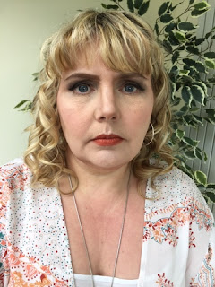
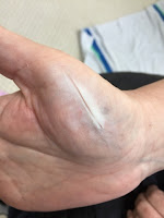
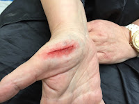
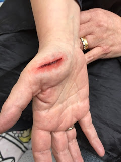
Overall, I am very happy with the outcome of this part of the project. I feel that the combination of hair, make-up and clothing help to create my motherly character with an 80s Miami aesthetic influence. I feel that the make-up is the biggest key to an 80s influence, with strong eyes and lips which I feel accentuate my model's features well. I feel that the messy curls are at a good medium so that they don't look out of place or over the top and balance well with the make-up. For the styling, I decided to focus bright and light clothing that would be suitable to the Miami climate and the use of details and jewelry help to suggest the character's wealthy past. For the location, I chose a well-lit living room, with natural sunny lighting and light colours, which is supposed to be Claudia's house in Miami which Mrs Laderman is searching which I felt was appropriate. I am pleased with the outcome of the injury, as because it was glass that cut it, it is a deep clean line cut which can be seen that it was done with something very sharp. If I were to create this again, I would like to purchase FX glass and add glass to the injury.

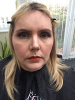
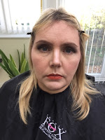
Character 2: Mrs Laderman. Step by step.

Products Used (in order):

  • Benefit's 'Porefessional' Primer
  • Kryolan Ultra Foundation
  • Kryolan Concealer Palette
  • Illamasqua Translucent Powder
  • Kryolan Glamour Glow Palette
  • Benefit Brow Zing (Medium)
  • Mac Cool Neautral Palette
  • Benefit 'Roller Lash' Mascara
  • Kryolan Creme Liner
  • Kryolan Lip Palette
  • Kryolan Cinewax
  • Kryolan Supracolor (Red and Black)
  • Kryolan Transparent Blood (dark)

Step by Step:

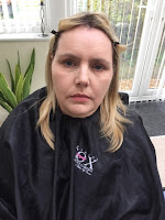
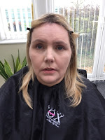
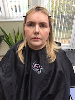
 1. First, I prepared the skin using cleansing, toning and moisturising. I then applied Benefit's 'Porefessional' primer to help reduce the appearance of fine lines in the make-up.

 2. I then applied the base, which I firstly used Kryolan's Ultra foundation and conealer from the concealer palette. I blended this in well with a kabuki brush before setting it with Illamasqua's Translucent Powder to prevent the fine lines from being visible. I then warmed up the skin tone and contoured the face using bronzer, highlighter and blush from the Kryolan Glamour Glow Palette.

 3. I filled in and shaped the eyebrows using Benefit's 'Brow Zing' and an angled brush.

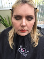
 4. I created a soft smokey eye using black, dark brown, light brown and white shades from the Mac 'Cool Neautral' palette.

 5. I then applied Kryolan's Creme Liner in Ebony and Benefit's 'Roller Lash' Mascara on the lashes.

 6. I then applied a orangey-red lipstick to the lips (Kryolan's Lip Palette) as I felt this particular shade of red complimented my model's skin tone.

 7.  I curled the hair all over, alternating in direction. using a curling wand which I loosely teased out with my fingers and hairsprayed.

 8. I then moved on to the cut hand, which I firstly applied and blended the edges of Cinewax and cut down the middle with a spatula.

 9. I then applied red greasepaint around the cut with a soft brush for a light application. I then used a small refined brush to add red inside the cut.

 10. I then applied a small amount of black greasepaint inside the cut with a small refined brush and then used to same brush to add dark transparent blood inside the cut.

Health and Safety:
  • Decant all product on to a palette before use.
  • Make sure all electrical equipment is PAT tested.
  • Use spray products such as hairspray in a well ventilated room.
  • Use disposable wands when applying mascara.

Evaluation of practice:

Overall I am very happy with the outcome of this practice. The one thing I would change about the overall look is that I would concentrate more on an even application of the eyeshadow above the eyelid so that the colour is more consistent. The thing I am happiest with the most is the cut on the hand, although like the eyeshadow, I would like the colour application to be slightly more consistent/smooth.

Character 2: Mrs Laderman - Final Design


Products Used (in order):

  • Benefit's 'Porefessional' Primer
  • Kryolan Ultra Foundation
  • Kryolan Concealer Palette
  • Illamasqua Translucent Powder
  • Kryolan Glamour Glow Palette
  • Benefit Brow Zing (Medium)
  • Mac Cool Neautral Palette
  • Benefit 'Roller Lash' Mascara
  • Kryolan Creme Liner
  • Kryolan Lip Palette
  • Kryolan Cinewax
  • Kryolan Supracolor (Red and Black)
  • Kryolan Transparent Blood (dark)

Consultation Notes:

Skin Type: Combination

Skin Sensitivities: None

Current Skin Care Regime: Daily cleanse, tone and moisturise.

Allergies: None

Skin Disorders: None

Contact Lens Wearer: No


Design

Above is the face design for my Mrs Laderman character. In the 80s, design typically included black, neon, primary colours, pastel colours and geometric shapes (as shown and discussed on my mood board for this character). From this, I chose to follow this as a guideline, but decided to scrap the neon aspects as I felt this is seen as too 'trashy' for my character due to her age and glamours way of living. Therefore, I included black in the eye make-up with black eyeshadow. I made the black harsh on her eyelid but well blended above the lid/below the brow as this was typically done in the 80s era. As my character is set in modern times, just influenced but the 80s (her prime time), I decided to leave out the bold use of blusher, particularly as I didn't want my character to look comical. I chose a bold red lip, which compliments the smokey eye and will also contrast with the pastel colours which I plan to incorporate in my character's styling/costume. I decided hoop earrings were essential as part of my design as it allowed me to incorporate geometric shapes in a way that is subtle but also modern. I also included strong eyebrows and long lashes in my design as this was beauty ideal in the 80s. I decided on messy curls for my design as I felt this would flatter my model's round face shape and also be very typical of the 80s era, particularly as perms were big around this time. As my character is in a scene where she is searching Claudia's house, I decided to add a part where there is tension when Mrs Laderman breaks something and risks waking Claudia up. In her desperation to quickly fix the broken glass, she cuts her hand by accident.

Character 2: Mrs Laderman - Initial Designs + Feedback


Above is my initial designs that I had included in my presentation.

Idea 1 - For this design I went for a make-up that was quite simple as I was going to make the hair the main focus of the design. Bold lips, simple eyes and voluminous sweeping hair for a subtle hint of the 80s. After completing my design, I considered how I could take it further with more interest and more of an obvious nod towards an 80s influence.

Idea 2 - Here I toned down the hair slightly and created a bold, strong 80s eye. After drawing up my design, I realised this would probably look too over the top and comical for my character and that I would need to reconsider my '80s' approach in a way that would create a happy medium.

Idea 3 - After looking at 80s Madonna for influence due to her being an icon, I realised that the late 80s featured a more smokey eye effect which creates a strong impact without the extreme bright colours around the eyes seen in the early part of the era. After considering the fact that my model has a fringe, I decided to go for the strong messy curls as seen on late 80s Madonna which I felt complimented my model's own hair. From this the hairstyle is easy to approach with styling, compliments the overall look and has a good impact. I included hoop earrings in my design as drawing it inspired me to include this in the styling to complete the look.


http://www.kurs-makijazu.pl/z-makijazem-przez-wieki/. (2015). [image] Available at: http://Madonna Hair [Accessed 7 Apr. 2016].

80s Madonna Make-up. (n.d.). [image] Available at: http://www.simplyeighties.com/madonna-fancy-dress.php [Accessed 7 Apr. 2016].